Navigate Her
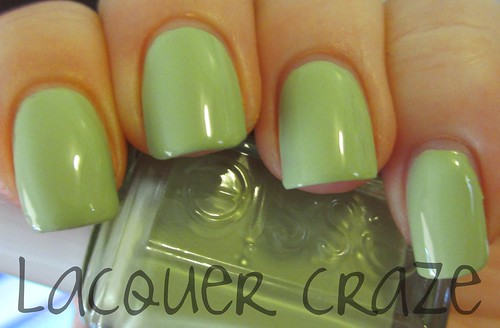
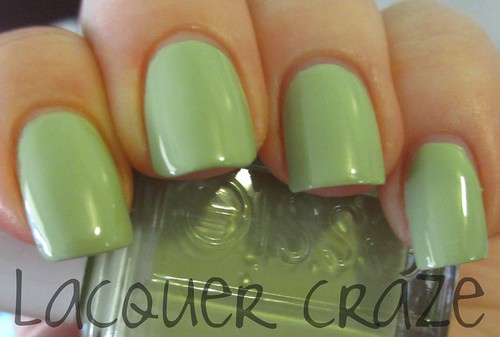
Navigate Her is a great pastel green. It's not minty like it might appear, but a little darker and more pale. More pistachio sort of color. I love this color. Application was great. This was two coats.
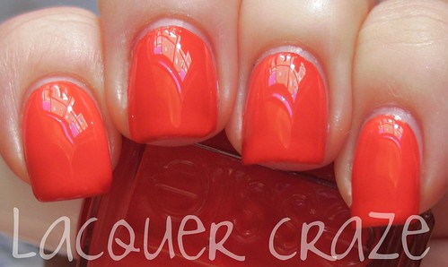
Orange, It's Obvious!
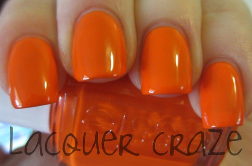
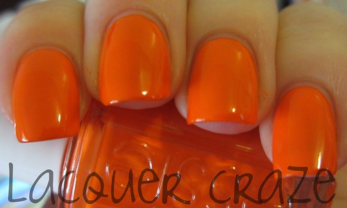
I have to comment on the name. This is so something I would picture OPI naming a color, so I was pretty surprised that it's Essie. Anyway, Orange, It's Obvious! is actually an orange I would wear. It's seems pretty neon in my pictures, and to tell you the truth I would say it's kind of bordering the neon line. Of course, it's not neon, but it's definitely a bright orange. This was two coats.
Ole Caliente
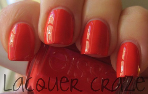
Ole Caliente is a bright red creme. I had a very hard time trying to get this color to photograph correctly. I tried different lighting, and it just wouldn't work. When it was in sunlight it appeared very orange on camera. These were the pictures that made it closest to true. Ole Caliente is a red creme that shows a lot of coral (this must be why orange keeps getting picked up). It's beautiful and pretty different from what I have in my collection. This is two easy coats.
Tour de Finance
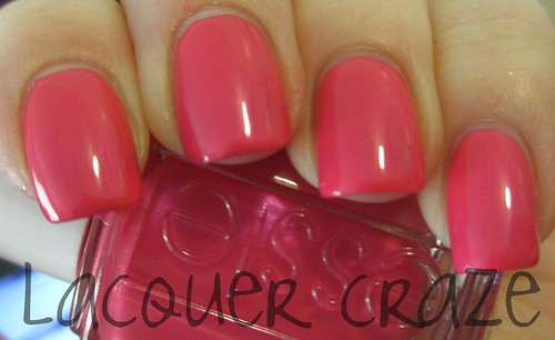
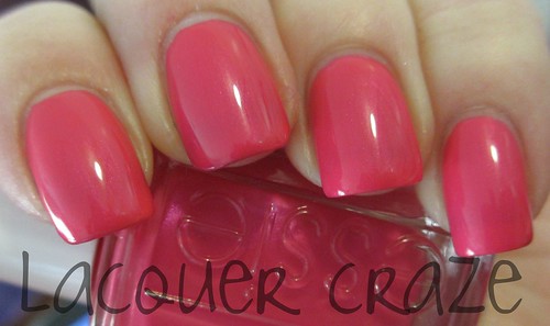
Tour de Finance is a bright pink! It has a pretty irredescant shimmer throughout the polish. You can see that most in the second picture. I own A LOT of pinks and surprisingly this one is very different. It's awesome! So easy to apply also; this was two coats.
To Buy or Not To Buy
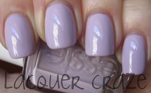
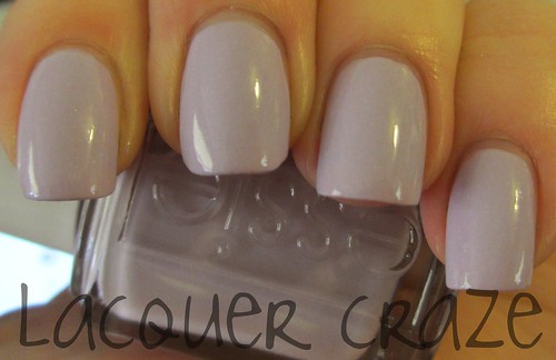
To Buy or Not To Buy is a purple lilac-y color with scattered shimmer, but sorry guys you won't find it on your nail. You can only find that beautiful shimmer in the bottle. I'm not sure why it doesn't show up on the nail, but it's really such a shame. I also had a little trouble applying this color. This was three coats.
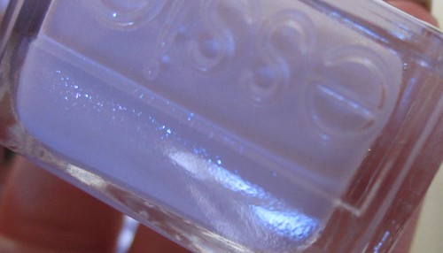
Here's a bottle shot so you can see the shimmer.
A Crewed Interest
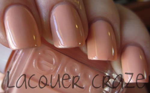
I had a second picture of this, but last minute I decided not to use it. I realized that the two are completely different and I didn't want to confuse you on what the color actually looked like. This picture is the best I could get. This was another polish I had a hard time photographing. A Crewed Interest is a nice peachy color. It's really great for a spring collection. My only complaint is this was another with a bad formula. It was pretty streaky on the first coat, and I needed three to really even it out. It doesn't bother me too much if I like the color enough, but I'm going to see if I have something similar to it in my collection. A co-worker pointed out Van D'Go so I'll have to compare them.
Overall, this collection is really great. I love every color. I'm especially psyched about the orange, because my Braziliant had a horrible formula, and I can see myself really wearing this orange out. My favorite from this collection would have to be Tour de Finance though. I normally would never pick a pink to be a favorite, but it really is beautiful. I probably would have chose To Buy or Not To Buy if that darn glitter would have shown though.
No comments:
Post a Comment